Corrections and Additions
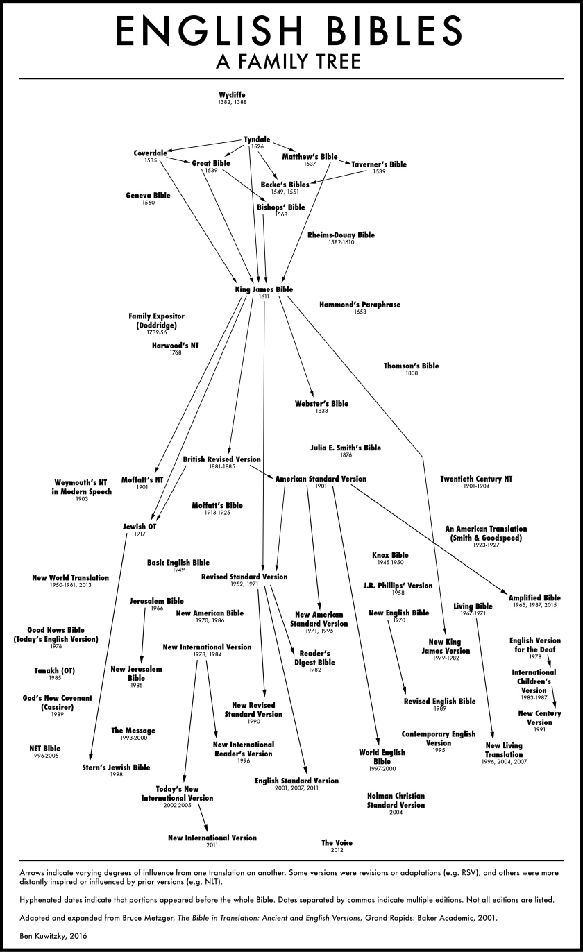
I was very thankful for the constructive feedback I received on my chart of English Bible translations. I took time to apply some of this feedback and make improvements in some key areas:
1) I expanded the width of the chart. Everything was very tight before, and as a result, some were seeing connections and relationships were I did not intend them. To be honest, when I started building this from the top, I didn’t expect I would need so much room at the bottom!
2) I added the following translations: The Knox Bible (a modern translation using the Latin Vulgate as a base text), The World English Bible (a fairly recent revision of the 1901 ASV), the New World Translation (yes, I really did put that in there), the English Version for the Deaf (the original translation that gave rise to the New Century Version), and The Voice (a recent modern speech translation that presents narrative with a unique play-like presentation).
3) I corrected the publication date for the NCV. The sequence between English Version for the Deaf and NCV was very complicated, with some revisions being published under multiple names within a very short period of time. The representation in the chart is somewhat simplified, reflecting what I saw to be three major stages of revision, and omits alternate names for some editions (e.g The Everyday Bible).
4) I added the 2011 NIV underneath the TNIV. One person made the good point that this edition was influenced by lessons learned from the TNIV, so it seemed appropriate to list the NIV a second time underneath.
5) I added an arrow from the 1901 ASV to the Amplified Bible.
5) I added “A Family Tree” to the title, to indicate the types of relationships I aim for the chart to illustrate.
Some Clarifications
It was obvious early on that this kind of chart cannot effectively communicate everything we might want to know about these versions. For example, I initially thought about somehow placing versions in the chart according to translation philosophy (form-based toward the left, and meaning-based toward the right?), but this would have been too complicated. For this reason, I opted for the chart to communicate only two things:
1) Date of publication, as represented roughly by a version’s vertical placement. I did not attempt to make this exactly to scale, so distances are relative to one another. For example, the distance between the King James Version and most 20th century versions has been compacted to reduce the chart’s size.
2) Relationships between translations, as represented by arrows. Arrows are an indicator not of similarity between translation philosophies, but of influence. I’ve defined influence rather broadly, indicating revisions and adaptations on one end, and looser manifestations of influence on the other. Determining influence according to this guideline is a bit subjective, so some might debate whether arrows should exist in some places. One weakness of this chart is that it appears to denote the same kind of relationship across the board, when for example, the relationship between the Living Bible and the NLT is actually nothing like that between the ASV and RSV. I saw another similar chart outlining early Greek versions of the Old Testament, and it used two types of arrows: a solid line for “direct descent” and a dotted line for “influence.” I think this kind of distinction would be helpful to apply to this chart. I may add it later when I have the time.

Hey Ben, thanks so much for putting this together. Would I be allowed to use this for a project I’m working on? Would be happy to talk further about what’s involved. jacob (at) arisestl (dot) com
LikeLike